Tuesday, December 17, 2019

Magazine post 26

Today, I worked on my creative critical reflections. My creative critical reflections focus on all of the elements that make up my magazine. Today I worked on two different creative critical reflections. I addressed the question, "How do your products use or challenge conventions and how do they represent social groups or issues?" In addition, I addressed the question, "How do the elements of your production work together to create a sense of 'Branding'? I am making steady progress on my creative critical reflections.
I am going to finish the last reflection at home today. It will be important to get it done now so that I can be ready to submit my project to AICE. I am confident that I will get the reflections done. I feel like the magazine turned out to be all right. My creative critical reflections are in the form of a power point. I am going to make my next reflection a Prezi.

Monday, December 16, 2019

Magazine post 25

Today, I continued to work on my creative critical reflections. I didn't get much done today as I was also busy fine tuning my magazine. I want the title and cover page to pop out at the reader so I had to do a few edits to be able to produce the product I wanted. I started work on my second creative critical reflection. I think the most effective method to finish my CCRs is to do them at home. I will have enough time to do them at home and I will be in a relaxed environment and therefore, will finish the CCRs in a decent amount of time.
I have finished production of the magazine and I am satisfied with what I have created. The only thing I have to do now is to reflect and finish my blogposts. All in all, I believe that the project will turn out all right.

Friday, December 13, 2019

Magazine post 24

We have been told to emphasize work on the CCRs. I am still a little bit behind but I hope to be successful by staying up late and working hard to finish. We are about to enter our last week of work before turning in our project for a grade. I am confident the amount of effort I put in is sufficient. I don't know exactly what the different forms of media I will use for my CCRs will be. I already have one done and it is a power point. I am thinking that the next two will be a video and a Prezi. However, since I am running out of time and have limited experience making online videos, I believe that the best course of action will be to make another power point and a Prezi. I have little experience in Prezi but I believe that Prezi is a better alternative to making a video.

Thursday, December 12, 2019

Magazine post 23

A lot has transpired from Monday to Thursday. My group is putting the finishing touches on our respective magazines. I have my product essentially finished. I do not know how my group is faring in terms of the completion of the project. From what I have seen I think my group mates are also just about close to completion. I have decided that I will update my magazines table of contents. I wanted it to stand out more so I made an arrow that surrounds cover stories. I think this adds a touch of design and pronunciation to the table of contents that just simply was not there before.
I hae started to think about the CCR questions and how to approach answering them. I don't know what formats I want to use. I was asking around and my groupmates thought that power point should be my first choice. When I told them that I was already going to use that they told me I should do a Prezi. Personally, I have never used Prezi so this will be a new experience for me. My groupmates told me that Prezi is quite easy to use. I hope they are right.

Monday, December 9, 2019

Magazine post 22

This week me and my team are looking to finish out the rest of the project. We have all of the elements we need to finish our magazines. I am going to be able to finish my magazine tomorrow. I have every part of my magazine done. My article is completely done. I have revised it enough so that I feel comfortable with it. My pictures have been completed and I feel good about what they represent. My cover is probably what I am most proud of it incorporates a variety of artistic techniques to grab a readers attention. With the help of my team, I believe that I have created a good magazine.
Up next on the agenda is to complete the CCRs. I have to review the questions and prepare my responses to them. I have not really been thinking about the CCRs so I will have a bit of time in class to go over how to respond to them with my teacher and my team. I believe we have to have to answer four different questions. I am going to fine tune my magazine then I will begin work on the CCRs. My magazine has a few details that need to be ironed out.

Thursday, December 5, 2019

Magazine post 21

It is getting close to crunch time. I have gone over all of the specifications of my magazine and I have finished the article in class. I have had my article peer reviewed by my group members and they say it looks good. I also had Nick take a look at my magazine. He says that It needs a few tune ups. I allowed him to show me what he meant. He went over my color scheme and we both agreed that it would need an upgrade. For my cover picture it was important that the color scheme would blend with it so we worked hard to find an effective color scheme we settled on the color scheme of gray and red. Even though we did end up changing the cover page, Nick and I both agreed that if we left the rest as it was my magazine would stand out and challenge normal conventions. Most magazines keep their color schemes uniform the entire time through we decided that my cover page being different would actually be a positive thing.
After this incident, I worked on polishing up my cover. Recalibrating my puffs and changing their fonts one last time. I changed the puffs to the fonts, Amaranth and Adumu Regular, respectively. With Nicks encouragement, I decided to change my advertisement or eye candy to right above the sweet spot. This allowed for my cover picture to not be undersold due to puffs getting in the way. It freed up space for the picture and it looks better. Overall, I am proud of how my cover page turned out and I have my team to thank for supporting me.

Wednesday, December 4, 2019

Magazine post 20

I finally got my interview with Ryan. I met him at lunch and we went over the questions I had planned out for him. I asked him questions such as, "what is your motto for running?" and, "Will you get serious about running?" I believe I got enough information to create an article based on his answers to my questions. As originally planned, I am going to make Ryan's interview into an article about his life as a Sarasota Sailor cross country runner. I finally have all the elements I need to be able to complete my project. Tomorrow in class I am going to finish writing the article. I have started writing the article at home. I am confident that I can finish the article rather quickly.
In addition, the interview gave me an idea. I asked Ryan what the shed means to him. He just looked at me for a little bit. When I explained to him that I wanted him to explain to me what the shed symbolized to him, he understood the question. He answered that he had so many memories around the shed and in the shed that will, "stick with him". I decided to include that in the photo of Ryan earlier as to give further meaning to the reason for the picture being taken in that particular setting in front of the shed.


Tuesday, December 3, 2019

Magazine post 19

Ryan and I hae set up a date for my interview with him. I will do the interview in three days which will make it a Friday. I am looking forward to doing the interview with Ryan. I already have the photo I am going to use to make my two-page spread. I spent today experimenting with ways I could manipulate Ryan's photo to make it stand out more. After many tries, I decided that simple was better.
I decided that I would not manipulate Ryan's image and instead opt for a simple but effective method.
Due to the way I shot the picture and where I shot it. Ryan's image already stands out due to the white background. I simply pasted Ryan's image onto a yellow background to keep with the theme of my magazines colors. I like the image this way the best and I think it will coney a silent message to the reader.


Monday, December 2, 2019

Magazine post 18

I am writing this blogpost at home because I want to discuss my photoshoot that occurred today. During class I focused on making everything perfect for the picture. I also decided what my reasoning behind where I was taking the photo and the specifications of the photo were going to be. I decided on taking a picture of Ryan in casual wear with his hat on backwards. The reasoning behind the look is that I wanted to emphasize that running isn't always serious. Running isn't about constant pain. In fact, the casual wear emphasizes that before Ryan is a runner he is a person just like everybody else.
I decided on the setting before we took the picture. My picture was taken near the track with the background of the picture being the team shed. There are a few reasons behind why I chose this specific background. Ryan has been persevering and running cross country every season and every day he comes to this shed and gets focused and ready to run. This shed symbolizes his constant commitment to running. No matter how far he roams, he always comes back to this shed. On top of this, I think the white background allows Ryan to stand out instead of blending into the background. It makes Ryan appear to be a little bigger than he actually is. White is a canvas you can paint on. Ryan is the paint.

The picture of Ryan that was taken:


Friday, November 22, 2019

magazine post 17

This day was all about making sure everything I have worked on up to this point is correct. I reviewed my table of contents one last time. I am satisfied with it and it meets my expectations for what a table of contents should look like. I have prepared my cover page for the placement of the photograph. Other than that I did not work on my  magazine much. Today I relaxed and talked to my teammates about the progress they are making on their magazines. It is important to note that we are all cross country runners ourselves and are constantly around each other and thus, work well together. We discussed what we all have changed in our magazine and what we thought the strong points of our respective magazines were.
I think that Nick's magazine is still the best. He has somehow managed to incorporate a bunch of visual aids that make his magazine look very professional. I asked him how he thought I was doing. He stated that I was making good progress. Robbie has managed to put together a very good magazine. He made orange and black his theme colors and they do wonders for his magazines visual appeal. I think my theme colors are unorthodox and because of this my magazine stands out.

Thursday, November 21, 2019

Magazine post 16

It is Thursday and we have further developed our magazines. I am looking forward to interviewing Ryan. We decided that I could take pictures of Ryan at the next practice we will both be attending. This date happens to fall on the Monday of next week. I am happy that I will finally be able to move on from developing my magazine without my photos. Today I finished up my table of contents. I used a different font than the coer stories strap line. This is to add an extra level of artistic value to the magazine. I finished my features section after I had felt that I had enough college commitment news from all of the states across the country.
Now that my table of contents is done and it's rudiments laid bare. I can focus back on my cover page and refine it a little bit. I decided to change the text for the puff, "The Region of Death". I decided to make the text into a different font than the usual as to emphasize the "death" element of the puff. I also changed the positioning of the puffs based upon what kind of picture I think I will be taking.

Wednesday, November 20, 2019

magazine post 15

This week has been moving very slowly as far as the project goes. I have not been able to progress on my project and it has become stagnant because I have yet to interview or take pictures of Ryan. This has been the hardest obstacle to overcome when it comes to the further development of the magazine. I have been researching headlines and my teammates and I help each other were we can. I am trying to find prominent figures outside of Florida to incorporate into my magazines table of contents. I have completed the Cover stories portion of the table of contents. I can use Canva more effectively now that I have sufficient experience in using it. I have decided to incorporate extra text below the title of the article to allow the reader to get a hint of what the article will be about. It is not meant to explain the article only to entice the reader to read the article.
I have not really even started into the two-page spread other than the title of it. Despite this, I did make some progress. I came up with what the subtitle will be of the interview in article format centered around Ryan. I came up with, "We asked Ryan exactly what makes him so important and special for the sailors" I think that this subtitle entices the reader to want to know exactly what Ryan said. Now that I have the full title of my two-page spread, all I need is the picture and interview with Ryan.

Tuesday, November 19, 2019

magazine post 14

Today I took time to reflect on my magazine. I had my teammates look over it. I wanted to have their opinions on what I could do artistically to make my magazine more appealing to readers. Nick made the suggestion that I should make my fonts less uniform. I took his advice and made the necessary changes. I talked with my groupmates about their magazines. I wanted to gain inspiration from seeing another persons magazine to see if I was on the right path. It turns out that they were willing to show their magazines and talk over what they had done. I noted the similarities and differences between our magazines and we decided to work closer and make our styles more uniform.
Each of us had a unique element we could bring to the table. However, Nick had the best idea. In my opinion, Nick's magazine is probably the best visually out of our three magazines. He said that the magazine should incorporate a Unique font that just applies to the picture on the cover. I realized that putting a unique font that just relates to the person on the cover enhances the anchorage you use on your coverage and even might serve as the anchorage by itself. I thought that Nick's point was very insightful. Due to this, I decided to change the font of the title relating to the picture. I changed it to Edo. Robbie added to this by suggesting that I should 

Monday, November 18, 2019

magazine post 13

I have discussed taking pictures with Ryan. He seems like he will be able to but we both have busy schedules and I might not be able to take pictures of him for a few days. Adding to the difficulty is the fact that I lie in Bradenton, FL and he lies in Myakka, FL. These two locations are nearly an hour and a half away. I have scratched the idea of a photoshoot in the city as I realized that having a photoshoot in the street wouldn't be practical. There is too much traffic hear in Sarasota and we would have to find a convenient place to shoot. As I discussed before I am seriously considering Payne park as an option. I am actually kind of glad that Ryan cannot take pictures now. I do not want to put it off, of course, but I want to focus on other elements of my magazine. However, I do realize that without a cover picture, I cannot place my puffs and other elements of the cover effectively. Even with this predicament, I do not feel stressed because I believe it will be easy to manipulate my puffs and elements of my magazine cover around my picture. 
I will continue to work on the artistic elements and designs of my magazine. I want to ensure that the fonts work together. I do not want any awkward fonts that don't coincide with the theme the rest of my fonts convey. In other words, my fonts cannot "contradict" each other. I am also experimenting with different colors to see which colors fit best with each other. I do want a variety of fonts to spice up my magazine.

Friday, November 15, 2019

magazine post 12

I could not take pictures of Ryan today. Instead I further focused on the basics and the outline of my magazine. I have been working on the table of contents. However, today I decided to split my time between the table of contents and the two-page spread. I cannot do much with my two page spread at the moment as I have neither a photo of Ryan or an interview with him. I just wanted to title the interview portion of my two page spread. I decided the title would be "Ryan: The man, The myth, a Legend?" I figured this particular title would capture the readers imagination and partially convince the reader that Ryan's interview might be worth reading about. It asks a question to the audience and I often find that if you leave an audience guessing they will want more and more knowledge about the topic; in this case Ryan's mastery of cross country.
The font I used for the title of the future article on Ryan is called chewy. It is a sort of bubbled in font and makes the letters appear to be wide. It adds to attention catching and this is the reason for the style of font. I am now debating on what the subtitle below the main title will say. I think it will hint at the information in the article further. It will probably be an intro to the intro of the article on Ryan.

Thursday, November 14, 2019

Magazine post 11

Today my group mates and I took pictures. We took pictures today but it was not when we wanted to take pictures. We wanted to do it earlier so we would have more time to focus on our interview questions. One of my group members is using me as a picture and he is using me as the focus for the magazine. I didn't take pictures today because I neglected to bring my phone.
However, I did participate in being the model for the pictures my friend was taking. In addition, my model is going to be Ryan and he isn't in are class. This is another reason that I couldn't take pictures in class. I didn't think coordinating with someone else outside of the class was going to be this hard. I will take pictures of Ryan soon so I don't fall behind.

Photo taken at this particular shoot:


Tuesday, November 12, 2019

Magazine post 10

Me and my group have run into quite a few problems. First and foremost, the amount of pictures we have taken is not substantial enough. We have a few but still need more for our respective magazine editions. In addition, the runner I am trying to interview has not been at school either because he is sick or because he's on vacation. I am going to try interviewing him today and if I can I will start using his dialogue in my magazine. I have also decided that my magazine will consist of a two page spread with one of the pages being a full shot of Ryan.
On top of all of this, I am having difficulty using Canva. Cana is difficult to use because of the limited amount of space the text boxes give you and the inability to shape the text boxes the way you want them to look. I have found that incorporating pictures into Canva I also difficult because you have to upload them to the computer first. My phone isn't equipped for this and due to this it is difficult to upload my photos.

Friday, November 8, 2019

magazine post 9

Let us just say that the photoshoot was not our proudest moment. No one could have expected that we would not have enough time to go down town. We made a little progress. During class, we left, with the teachers permission of course, to take pictures at the track. We got some pictures taken. I modeled for Nick and we took a picture of me running up the bleachers. In addition, we got some pictures of me running around the track looking super serious. I am glad I helped my teammate out.
During this process our other teammate Robert was taking pictures of Nick while this process was going on as to document it for him. Today we really just focused on helping Nick with his magazine. Both of us plan to do photos at another time. Robert is thinking of taking photos of Nick during one of his Payne park workouts. This is a great idea and I might be able to do the same thing with Ryan.


Tuesday, November 5, 2019

magazine post 8

We still have not been able to get time out of our schedules to do pictures. We hope to do them today after school. Since the person I am taking pictures of is not in our class this is the most effective way to do a photoshoot. I believe, as does my team, that taking pictures downtown will reflect what we as a group love about running. Due to the fact that we are taking pictures later, I decided to move forward as best I can and work on the table of contents. While we don't have pictures yet we are committed to making the rest of our magazine ready for the exam.
As stated before, my table of contents was my main focus for today. I worked with my teammates to incorporate a uniform title for the table of contents as well as a uniform format. However, my teammates and I agree to disagree when it comes to the design and font type of the table of contents. I want a more sleek look but I am being overruled by my teammates, I was not going to win that fight. I am thinking about incorporating a few of my own designs that will subtly blend in with their ideas.

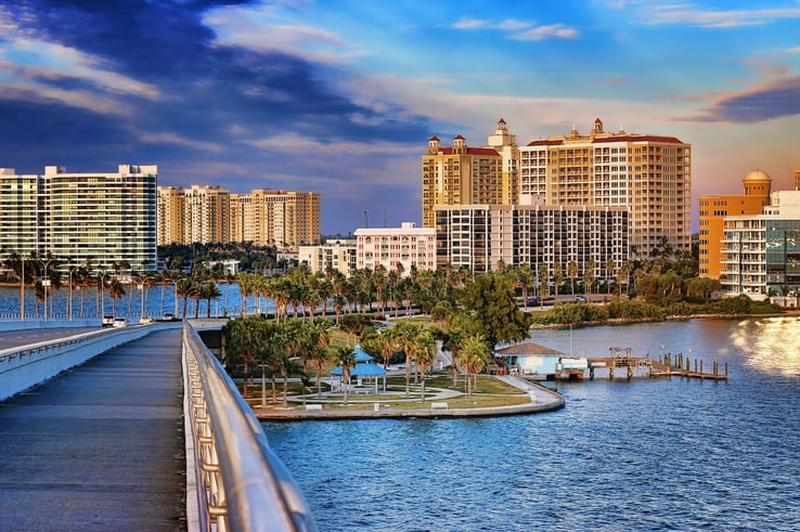
Image result for downtown sarasota

Monday, November 4, 2019

magazine post 7

My group and I have decided to move the picture day to November 5th because one of our group members has work November 4th. We also decided that instead of Payne we are going to do our photoshoot in downtown Sarasota. We did this because most of the runners world magazines we looked at were set in urban settings. We want to make sure that all of our "subjects" are aware of the time and place that we are meeting at.
It is important to note that we are not experienced in this sort of thing. We will try our best but I believe that, inevitably, we will have to have another photoshoot. The best person in our group at taking photos is Nick Rich. I will ask him for tips on how to get a proper shot and how to effectively incorporate it in my magazine.

Wednesday, October 30, 2019

Magazine post 6

The group decided that we are going to have a photo shoot on the fourth of November. I am going to use a kid named Ryan. Ryan is a good model because he is a good runner that people in the area will know. He will still require anchorage because he is a local runner. I have decided that I am going to use Tinman elite as an advertisement and sponsorship for my magazine.This is important because many runners can relate and look up to Tinman elite.
As I stated in a blogpost earlier, I want the runner that I feature to embody running. Ryan embodies the part of running that makes you continue to run. He is such a fun personality and you need a personality like that to succeed as a runner. It helps you push through injury and tough durations during running when you are just not feeling it. Through it all Ryan has made me laugh more times than I can count and allows me to relax when I run. He has also persevered through injury. Overall, Ryan is someone I am proud to have on my cover page.

Tuesday, October 29, 2019

Magazine post 5

Today I focused on the pictures and design type I want my photos and cover to have. I think a full shot will be most effective for the title. I think a close shot wouldn't blend well with a running magazine. All of the running magazines I have researched appear to actually show the runner in action rather than just their face. I want my photos to encompass the runner I am doing my article on. I want my photos to reflect what being a runner really means. It is vital that I get the message across that running is not something that has to be dead serious and it doesn't have to be something you have to do. It can really be enjoyable.
I believe that who ever I pick to do my story on has to embody what running should be about, having fun and being social. You have to be serious when required but on the whole you should enjoy every minute of running. I think my photos will embody what it means to be a runner. The rewards and enjoyable moments of running will be evident in my magazine.

Monday, October 28, 2019

magazine post 4

Today, we again focused on looking at magazines. I have recommitted myself to college commitments. I think this is an important aspect to consider when assessing the topic my team and I have chosen. A big part of being a high school running is hoping that one day running opens up pathways for you. It would resonate well with our intended audience which is high school runners all over the country and specifically runners that are located down south.
We have established what the direction of our magazines will be in terms of the font. It is obvious that the font needs to stand out. We are separately working on the magazines but we still need to make our titles uniform as to increase our magazines feeling of professionalism. We are working separately on creating our puffs for our magazine covers. We have established what our title is going to be: The Distance Project. Beyond our title we have not thought of much other than the accompanying puffs. We hope to begin working on photography soon.

Wednesday, October 23, 2019

Magazine Project Post 3

Today we focused on learning about popular house styles. We came to the conclusion that most running magazines have a very simple house style. We also devoted some of our time to learning about the technology we would be using to create our magazine. We believe that we will be using a more bold house style than most magazines. In addition, we want to use multiple styles in our respective magazines.
I am not sure what fonts I am going to use to bring a different sort of vibe than the other popular running magazines that are already being produced. I understand that I have to make my magazine stand out from other magazines but I am not sure exactly what I will do to make this happen. I am going to have to sort through different fonts to find the right meaning and purpose.

Image result for canva

Tuesday, October 22, 2019

Magazine project post 2

Today we talked about what each individual group member was going to focus on. We already have our overall topic high school running. We just needed to focus on what each individual was going to focus on in their particular version of the magazine. Nick decided to focus on track. Robbie is focusing on cross country. I was focusing on cross country as well but I was going to make sure that me and Robbie's magazine covers differ.

However, later during class we decided that I am going to focus on the post-season aspect of cross country. This means that I will focus on the "playoffs" of cross country. I will also go over commitments by cross country runners in our area. Robbie is going to just focus on the cross country regular season.

Monday, October 21, 2019

Magazine Project post 1

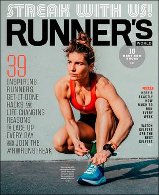
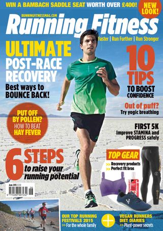
My group and I have decided to focus on running for our magazine. We chose running because we can all relate to it as we all run for our high school team. After making this decision we decided to look into different running magazines for inspiration. Runners world stood out to us because of the bold font in the house style they use. This magazine also stood out because it used contrasts to promote the runner in the image.

This first day was just about getting to know one another as a team. We just browed popular running magazines looking for good qualities that we might want to incorporate into our own separate magazines. Runners world was a good magazine but we wanted to expand our knowledge on this particular genre. So I also looked into other magazines ,such as Running Fitness, for inspiration.

Image result for runner's world imagesImage result for runner's fitness magazine